My DOP, Jorge, and I met while I was in Madrid to discuss the last edit and find some references for the color.We agreed on keeping it with natural colors, not too saturated or contrasted.
For the skin, Eric Rohmer is perfect as a reference. He shot most of his production in 16mm with beautiful skin tones.
For the sand tones, I want some earth shades. I know this first reference is digital and our footage is 16mm shot in Bolex, and won’t get as intense as this. But I like the tones, maybe a bit washed down.
More (1969) by Barbet Schroeder, is also a good reference for natural and soft grading. I’d like to get the color closer to the golden hour shots I have, but nothing too intense.
We continued working on doing the credits over the last frame of the moon. Ana sent me a very good and detailed draft with some ideas of composition:
I sent some notes back to Ana.
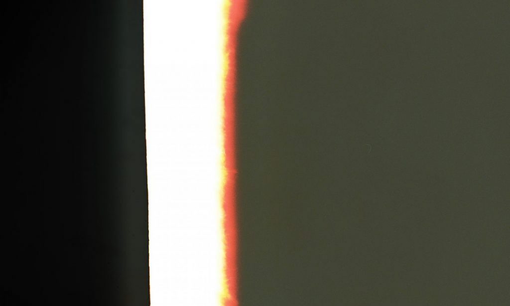
-I really like the sun/moon symbols underneath my name: “A film by L.A.” L.A. stands for Laura Aguilera, the sun is the first frame and the moon the last frame of the movie.
-The logos aligned to the moon work perfectly composition-wise.I am looking for white versions of the logos, as it’d look great next to the white moon.
-Regarding where to place the names of the team, I think I prefer them as a block at the bottom. I could have that frame to stay longer on screen and give time for reading. We need an extra slide that says: “Thanks to Alice Potts, LAZCANO, etc..”
Ana sent me a few ideas for the titles of the film. I really like them but I don’t think they represent me or the film. We tried working with something more geometric and typographic:
The last frame of the edit is the moon and I like to keep it for the credits with the sound of the wind. I like the line in which the graphics are going.
The first test of the poster doesn’t really work with the rest of the aesthetics: